Besides survey design, survey statistics are extremely important for users. SurveyCake provides powerful analysis support that includes responses data list as well as instant statistical Chart Report for analysis!
To enter Chart Report of a survey, simply open the Survey Dashboard and click on a survey. Instant statistics and corresponding charts for each question can be found on the page.
Features of the Chart Report and its six corresponding question types are introduced as below:
The response results of the Single Line Text question are presented in a Word Cloud.
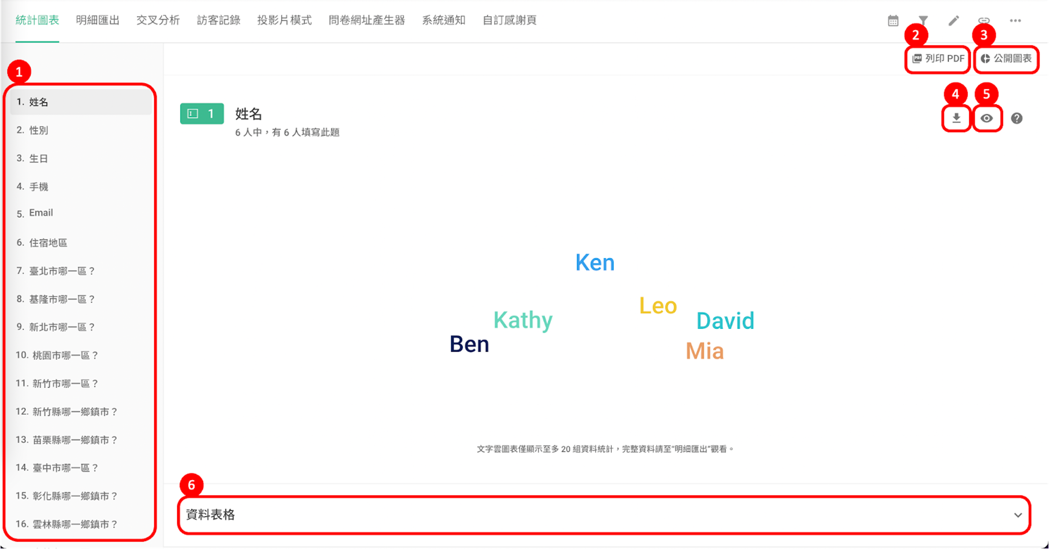
Considering the data volume and the response length being limited by system interface, the word cloud only displays up to 20 data records. To see the complete data, it's recommended to view it in the Data Report.
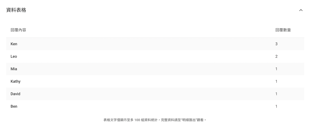
By expanding the Breakdown Table of the Single Line Text question, you can view more detailed information; However, due to space limits, the Breakdown Table defaults to show only up to 100 sets of data. Again, for complete data review, turn to the Data Report.
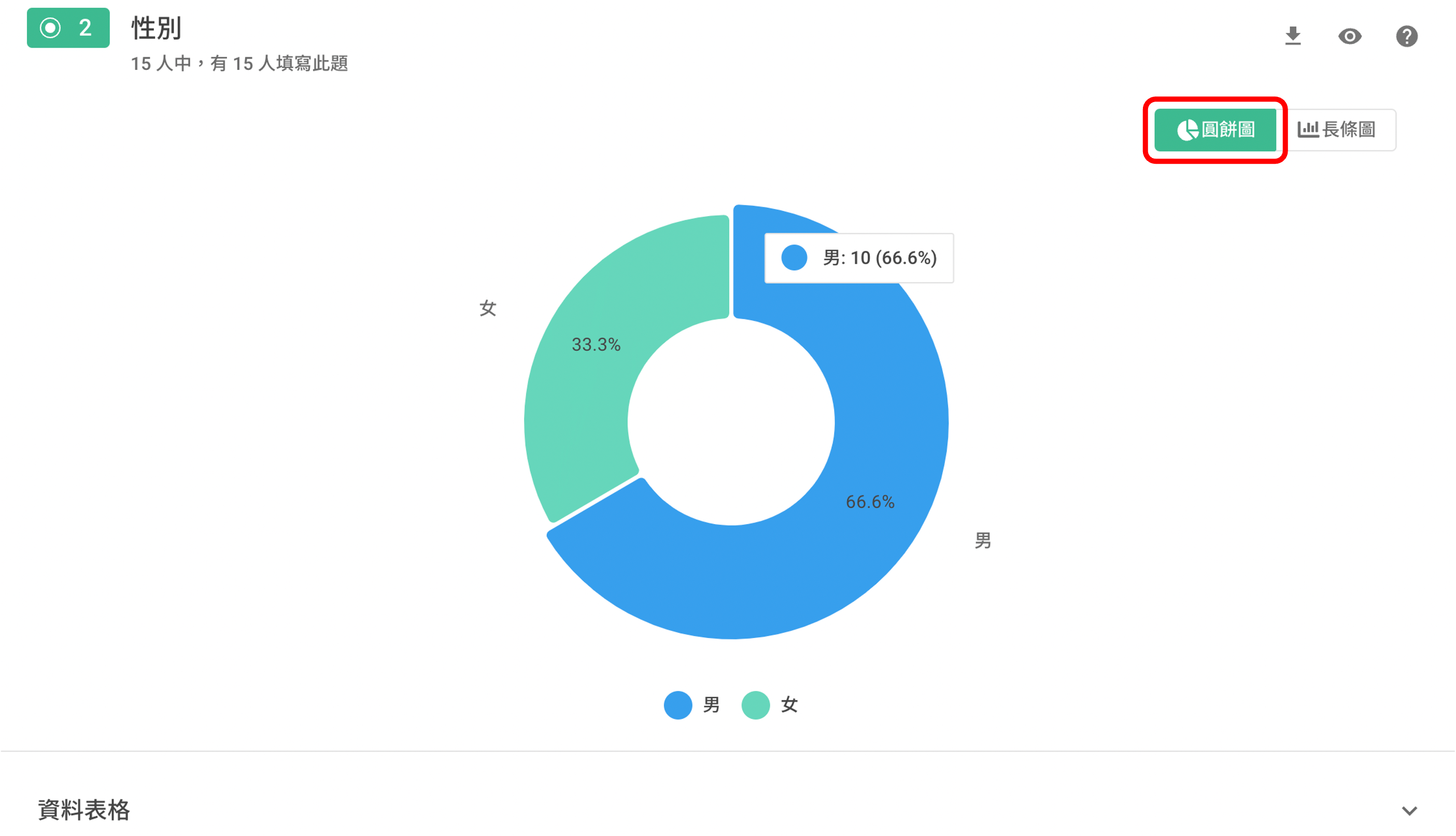
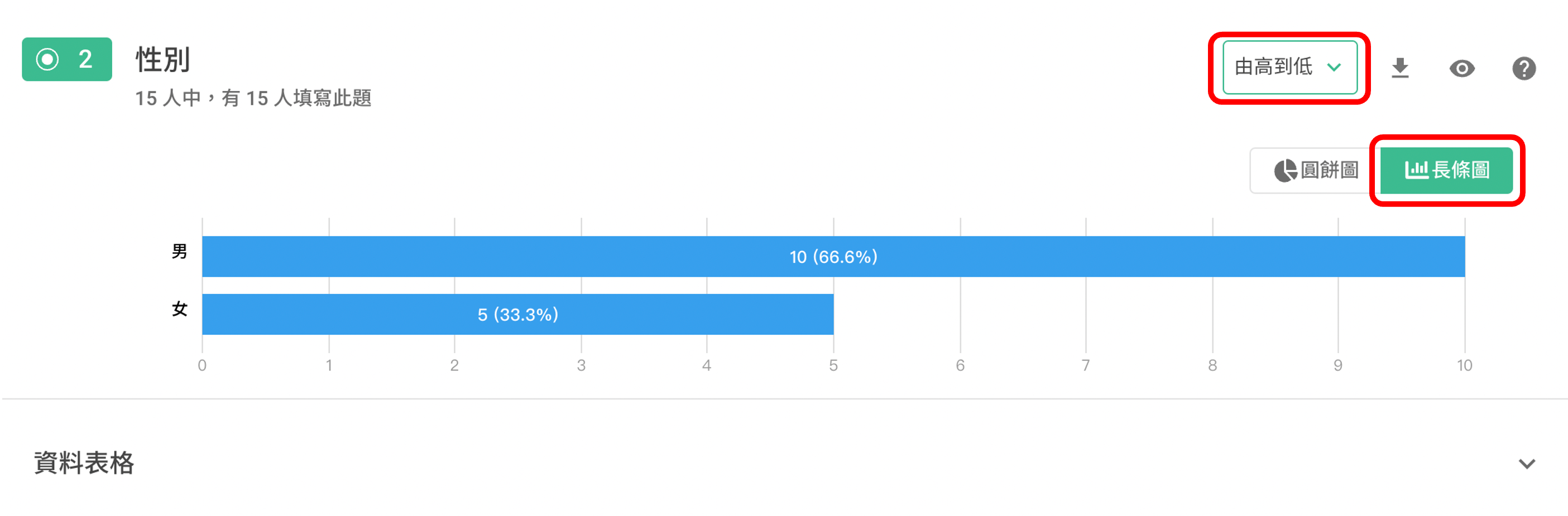
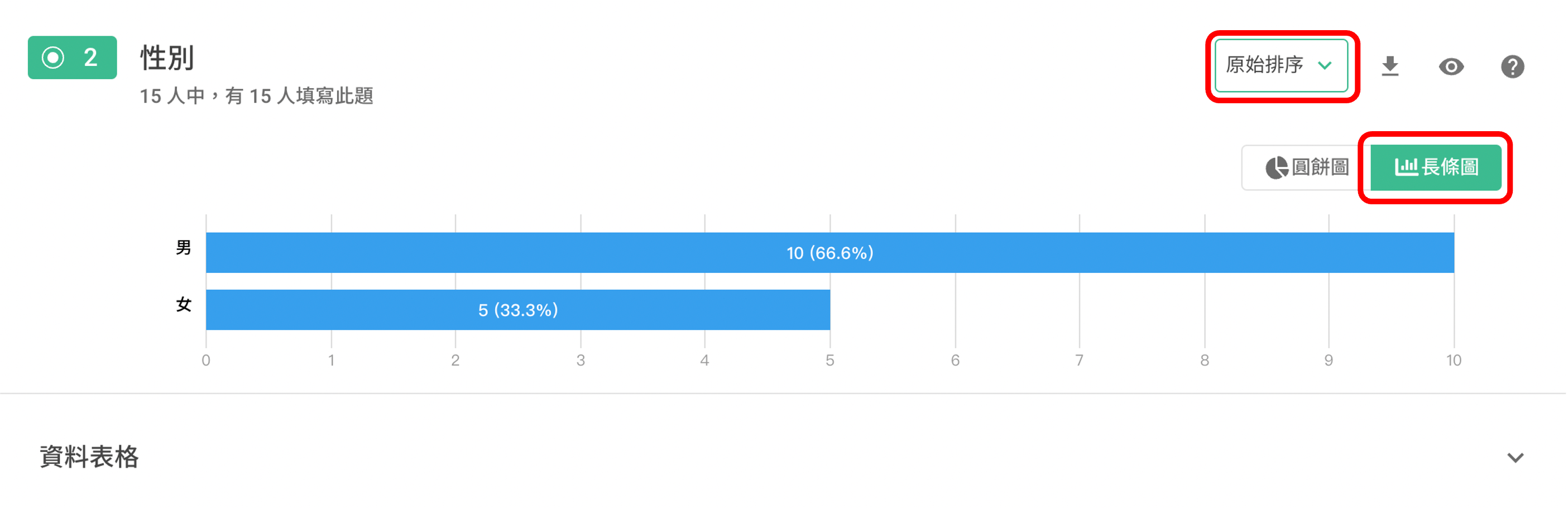
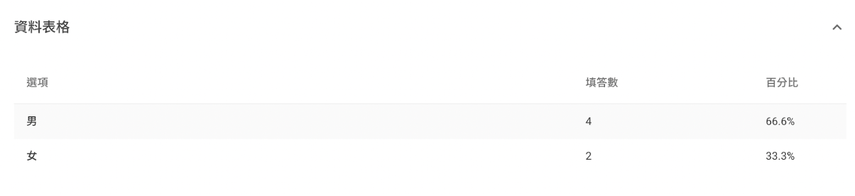
The results for multiple-choice and single-choice-matrix questions are displayed in tables. Users can also toggle between pie charts and horizontal histograms on the right. The proportion of each response is shown by hovering the mouse over a color block. Expanding the Breakdown Table of Multiple Choice allows you to see more detailed information.

Pie Chart
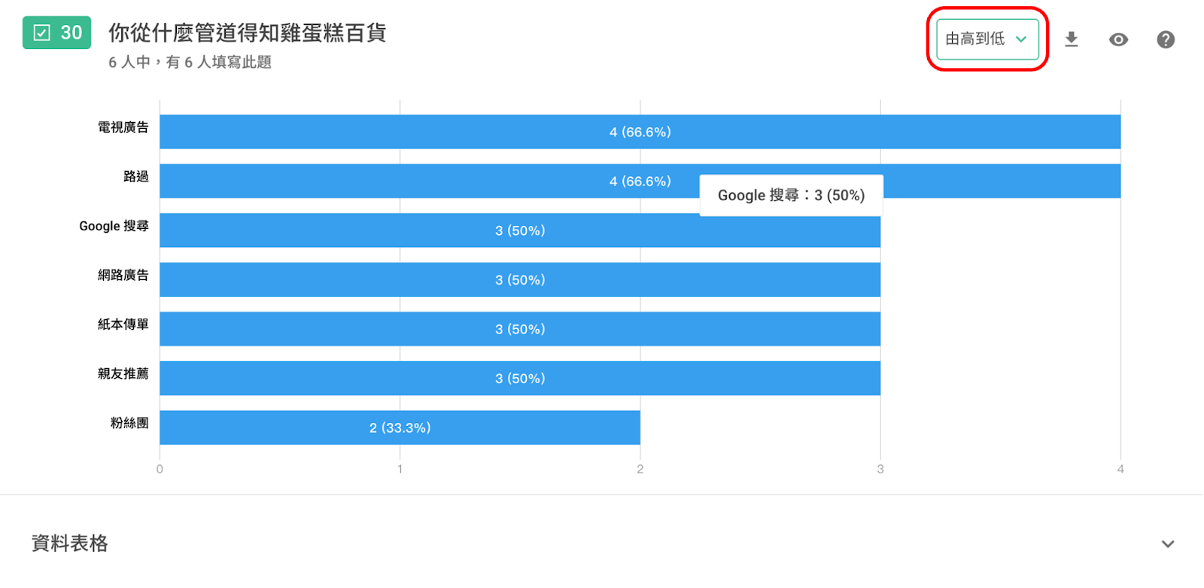
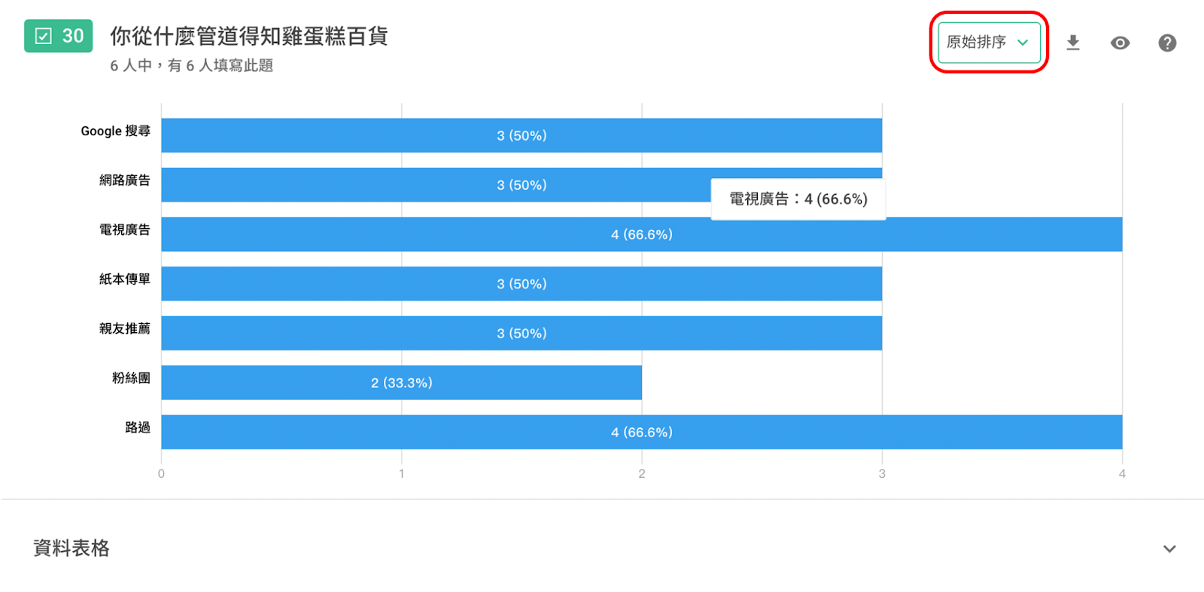
Bar Chart: You can choose between 'From highest to lowest' or 'Original sorting' to determine the display order of the bar chart.
'From highest to lowest': Sort according to the frequency of each option.
'Original sorting': Options are displayed in the order they were originally presented in the survey.
Both the Checkboxes and Selection Based questions, including the Date Picker and Rating, display the results in a horizontal bar chart. The display order can be chosen as either 'From highest to lowest' or 'Original sorting'.
The Rating question also uses a horizontal Bar Chart with 'From highest to lowest' or 'Original sorting' as the display order. An "Average Rating" is, additionally, displayed at the top right corner.
Ranking questions are represented by a horizontal Stacked Bar Chart, providing two calculation methods: 'Original' and 'Weighted'.
'Original': Display the quantity of times each option was selected.
'Weighted': Multiply the quantity of each selection by the weight to achieve the weighted result. The weight is counted from 1, with a lower order translating to a lower weight (e.g. If the rankings are 1, 2, 3, then the weight of ranking 3 is the lowest at 1, the weight of ranking 2 is 2, while the weight of ranking 1 is 3, etc.).
Both the Number and the Slider questions are represented as histograms. Below is an example using the Number question:
You can view the Single Choice Matrix question in a Stacked Bar Chart and a Radar Chart.
Then, detailed data for each dimension can be analyzed through horizontal histograms and pie charts.
FAQs
Can I view charts for specific data only?
Absolutely! You can use Date Filter or Filters to filter out specific data for data charts.
Why can't I see new responses?
Please go to the Account Setting and check if you are currently on the BASIC plan or not. If your current plan is BASIC, it is likely that the surveys you created had utilized PRO features while subscribing to PRO plan. After canceling your subscription, you will not be able to view the responses collected through PRO features. If you want to view new responses, you can simply resubscribe to the PRO plan.
For more information, please refer to the Cancel Subscription.
Summary
Chart Report enables fast data analysis and generation of practical charts, simplifying the survey summary process. This feature provides a clear overview in an instant!